Wednesday, 22 February 2012

The answer I was looking for

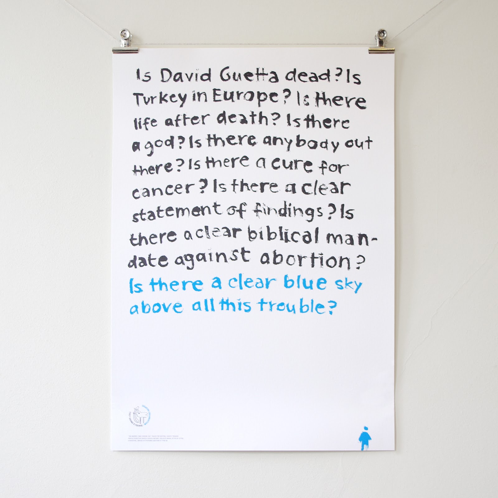
'The answer I was looking for' traces the shifting, ghostly phrases Google Predictive Search (Google Instant) suggests when, letter by letter, a beautiful, unique or profound question is typed in. Collaborative project by aka Seagull & Sword - Takooba and Ursula Hitz.
More info on takooba/the-answer-i-was-looking-for


Print #1 Hotmail. - How do I know the contents of my heart?
Print #2 Do a barrel roll. - Do I hear god or the devil calling me?
Print #3 Is David Guetta dead? - Is there a clear blue sky above all this trouble?


Details:
limited editions of 100, signed and numbered, printed on Hahnemühle Etching paper,
42 cm x 59 cm, delivered rolled in postal tube, fits into a standard A2 frame, available at Seagull Hut.

Monday, 20 February 2012

Olympic Torch Print


Freshly screen-printed: Olympic Torch print.
Limited colour edition (silver/orange). 17.5 
cm x 52 cm. Available at Seagull Hut.

Wednesday, 9 November 2011

Rome Type Map


Latest addition to the typographic map series is out now.
Lettering is based on Trajan (font) which letterforms are based on an ancient Roman form of writing.
Includes the seven hills of Rome, parks such as Villa Borghese, Centro Storico including Spagna, Fontana di Trevi, Roman Forum, Palatine Hill, Circo Massimo, and Vatican City, Trastevere and Janiculum to the west of the Tevere.

Details

Limited color edition of 100, slate gray/silver, signed and numbered by the artist, printed on Somerset printmaking paper. Available at Seagull Hut, Bouf and Culturelabel.

Tuesday, 25 October 2011

Lino Stamp


Here's a sneak preview of a new typeface I'm currently working on. It's based on printed lino-cut letters. Letterforms imitate Futura Bold Condensed. A demo version is available at dafont.com/lino-stamp.font and at Seagull Hut.

Thursday, 21 July 2011

Greater London Type Map


Finally the long awaited the Greater London Map is ready for sale.
Includes Enfield in the North, Sutton in the South, Southall in the West and Romford in the East. Prints have been produced in London. It is a limited colour edition, screen printed on archival paper. Available at Seagull Hut and culturelabel.com

Monday, 13 June 2011

Featured in Completely London


I'm very excited to see my work featured in the latest edition of award winning Completely London Magazine. The article is quoted below.

GEOGRAPHY LESSON
Typographical artist Ursula Hitz puts your borough on the map – created exclusively for Completely London
Swiss-born artist and resident Londoner Ursula Hitz has a way with words. Her distinctive brand of prose reaches beyond paperbacks and on to the city maps she creates out of a visually charming jumble of hand lettering. There’s order among the apparent chaos, as the typography represents the boroughs that make up each city – Zurich, New York and Paris have all been laid out. Why the passion for place names? ‘I love becoming fixated on their intricacies, before taking a step back and seeing a bigger structure evolve,’ she explains. ‘Unlike regular maps, mine don’t focus on streets or buildings. Instead, they build an organic texture of words that grow from the centre – in the way that most cities have grown.’ · Donna Hardie

The readers' edition (limited edition of 100, signed and numbered, black/pearl blue), is now available at CultureLabel and Seagull Hut.

Friday, 27 May 2011

Letters to...

 
Letter to Sex


Letter to Laughter


Letter to the ones we've lost


Fascinating series of letters made of colour snippets by Spanish artist Catalina Viejo Lopez De Roda. See more of her work at Saatchi Online.